
Bru House Coffee House
Redesigning local Coffee House website to improve usability and brand identity → interact with final prototype
Overview
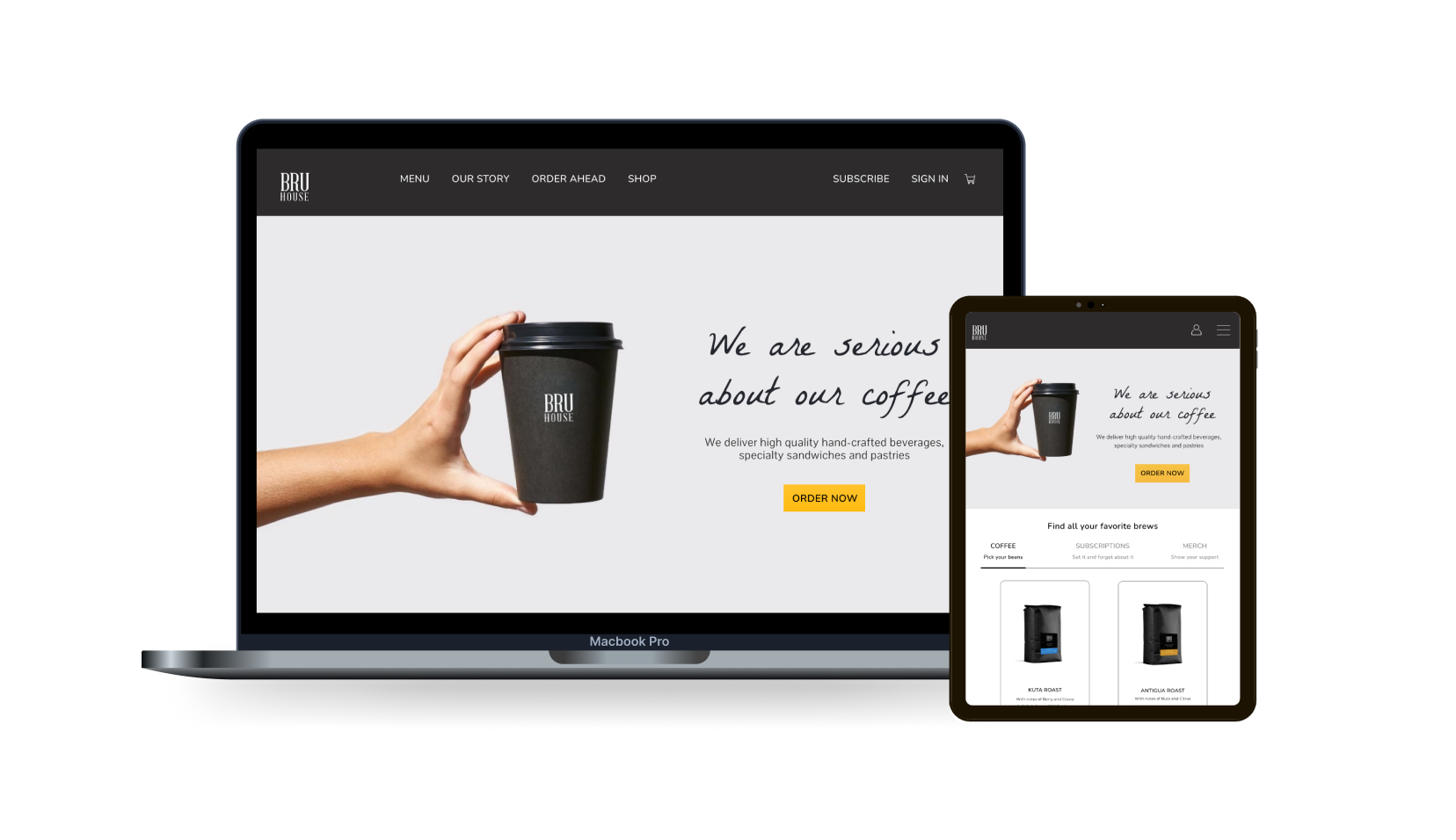
The Bru House is a family owned coffee house that is located in New Brighton Minnesota. The coffee house has been seeking to improve their online presence and create an internal purchasing experience that keeps customers on their website.
My Role
Product Designer
Information Architecture
Prototyping
Testing
Platform
Responsive Website
Timeline
January— February 2022
The Problem
I conducted guerilla usability testing with 15 individuals who have visited Bru House previously to gain insight on the existing website and determine what areas could be improved.
I identified 3 user problems with the existing website:
1. Poor Navigation
Website users have trouble finding information about the business
2. External Shopping Page
Inconsistent to experience, guides users away from the website
3. Brand Image
Existing website lacks in branding and doesn’t showcase Bru House’s brands identity.
Guerilla Usability Test
The purpose of the guerilla usability test was to improve my understanding in the following areas:
• Gain insight on how participants felt about the existing website
• Learn what aspects of the existing website are unclear or confusing
• Determine what areas could be expanded on and could improve functionality.
Key takeaways from guerilla usability tests include:
• Gift card tab could be embedded into website, it currently guides the user to different webpage.
• Hero image on website doesn't relate to coffee shop
• It gets the job done but feels outdated
• Wasn't sure which navigation button would lead me to hours
• The menu is a scanned image of actual menu making it hard to read and navigate
A survey was conducted with 30 participants to better understand user expectations
The goals of the survey were the following:
• To understand what participants expectations are when visiting a coffeeshop website
• To learn what motivates them to explore such a website
• To grasp what information and content could contribute to a more lucrative experience
Key takeaways from survey responses include:
• Website should have efficient browsing experience that makes it easy to find service information
• Needs simple navigation that is easy to understand and that guides user to intended outcome
• High quality imagery of products to give customers a good idea of what they will experience
• Majority of participants stated they visit a coffee shop website to look at the menu, others highlighted that they visit the site to check the shops hours and promotions.
Analyzing the problem space
After conducting the survey and guerilla usability test, I was able to identify many of our user pain points and I wanted to gain insight on some of the local competitors online presence, and what Bru House can do to improve their website
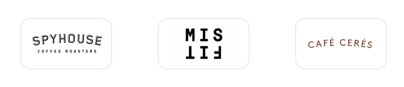
Strengths I focused on implementing:
Minimal UI and simple navigation
Embedded Instagram photos on website
Applying Shopify template to create clear and concise transaction flow
Order for pick-up within website
Weaknesses I aimed to avoid:
Excessive visual design
Third party transaction provider
Not enough imagery of business
No menu available
Solution
Putting it all together
By conducting my research I was able to better identify what changes would greatly impact the website.
Intuitive Checkout Experience
By applying a Shopify template users are able to purchase products more efficiently
Effective Navigation
A navigation bar that prioritizes key pages that visitors seek to find and read
Enhanced User Interface
A user interface that highlights the brands identity and engages the user all while improving the functionality of the website


Empathizing with Cafe Visitors
Provisional Persona
After completing my research it was time for me to evaluate my results by identifying my participants goals and pain points by creating a couple of personas.
Information Architecture
Site Map
Once I identified the potential website user it was important for me to map out the hierarchical structure of the website in order to better understand how the website would be integrated.
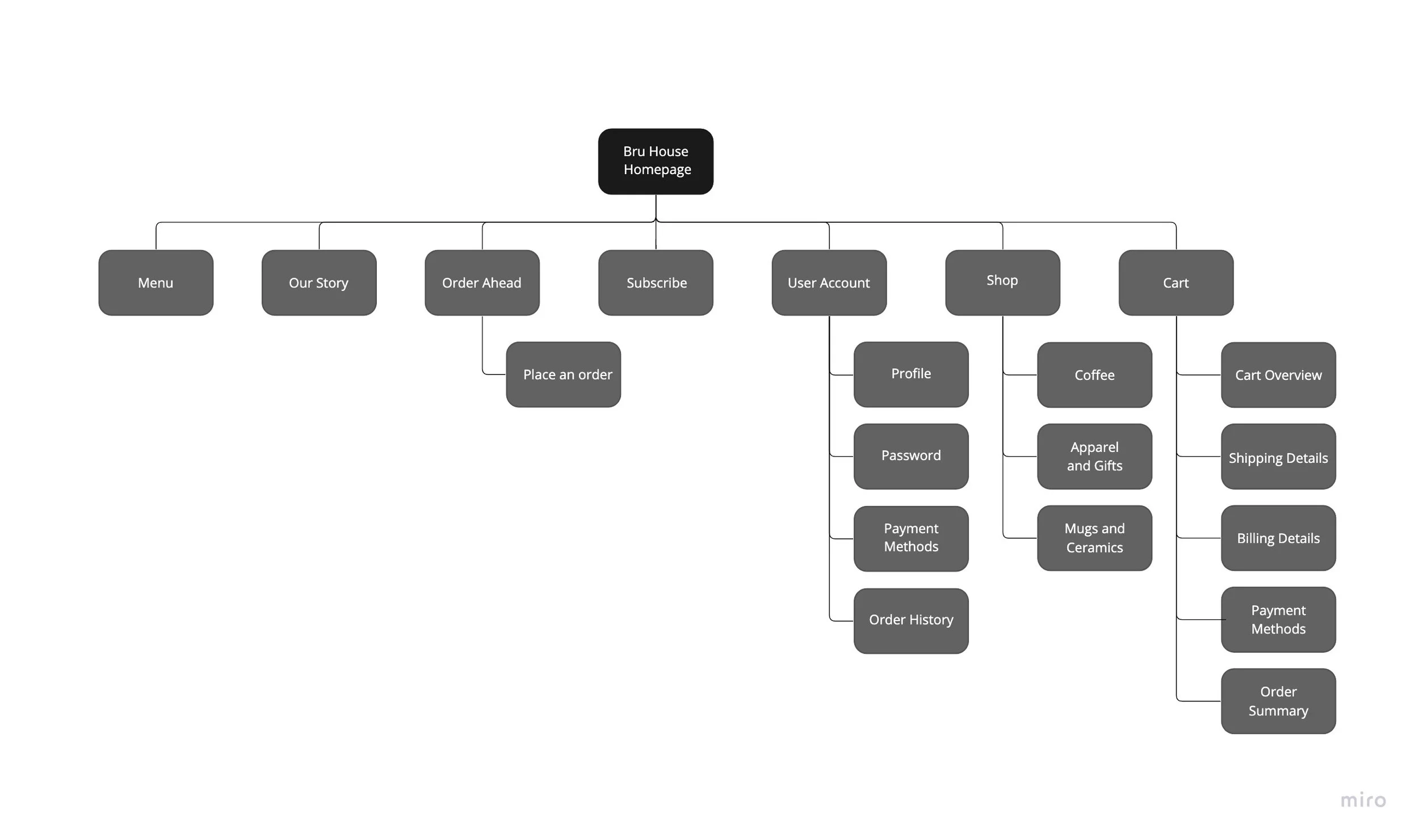
View→ Site Map
Task Flow
After establishing my website structure, I wanted to highlight several paths a user could take to accomplish a few desired tasks.
View→ Task Flow
Designing
Sketches
By sketching a couple of layouts I was able to get a better idea of how the landing page could be organized. I analyzed my research results to identify categories that I could apply to each section. I focused on emphasizing what users wanted to find on the website.
Wireframes
After establishing three layouts in my sketches I decided to hone in on a few key concepts and incorporate them into my landing page. In my wireframes I wanted to create a clear structure that would emphasize consistency throughout the different pages.
Testing
Prototype
In this prototype I strived to create an experience that felt consistent from the landing page to the completion of purchase. I was able to accomplish this by creating a solid framework that focused on visual hierarchy and information architecture in the early stages of my process.
Usability Test and iteration
Once the high-fidelity prototype was created, it was time to test it with my previous research participants. The goal for usability tests were to understand where my designs fall short, as in where are participants struggling, and where do they become frustrated when navigating the prototype.
I conducted the usability test over Zoom, and had participants screen share for the entirety of the test. I asked them to complete three tasks and observed them navigate the website.
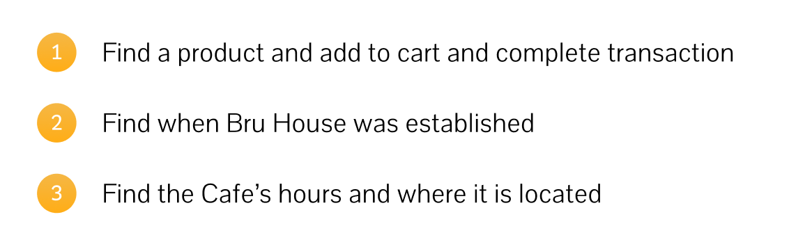
Here were some of the key takeaways from the usability test:
• All 15 were able to complete the requested tasks, participants found the checkout flow to be clear and simple
• One of the back buttons were not clickable which confused a couple of the participants.
• Participants recommended using a colored stroke to identify which photo is being displayed in the product photos.
Changes based on the usability test results were applied to updated prototype.
What I learned
In this project I learned how important it is to select the correct research methods for the problem. In the beginning phases, I was having trouble deciding how to approach my problem but I am glad that I was able to begin by conducting usability tests to gain insights on participants perspectives on the existing website. This helped guide me in the right direction and allowed me better understand the users pain points and how the website could be improved to better fit the users goals.
Moving forward I plan to present my finding to Bru House coffee and get feedback on my designs. I plan to use that feedback to iterate on my prototype.