
Discover with SpotHero
A browsing feature that provides access to nearby businesses and services → interact with final prototype
Overview
SpotHero is a digital parking marketplace that allows drivers to search for parking spaces, lots, garages, and valet services, often at a discount to the drive-up rate. Individuals are able to search for options, compare prices, and reserve their spot on the app.
Spothero contributes to providing an efficient way to find parking near your intended destination, making it simple and convenient to make decisions on where you want to park. This isn't the reality for some people as they find themselves parking in areas with very few businesses and services near them, significantly reducing the convenience of a parking spot.
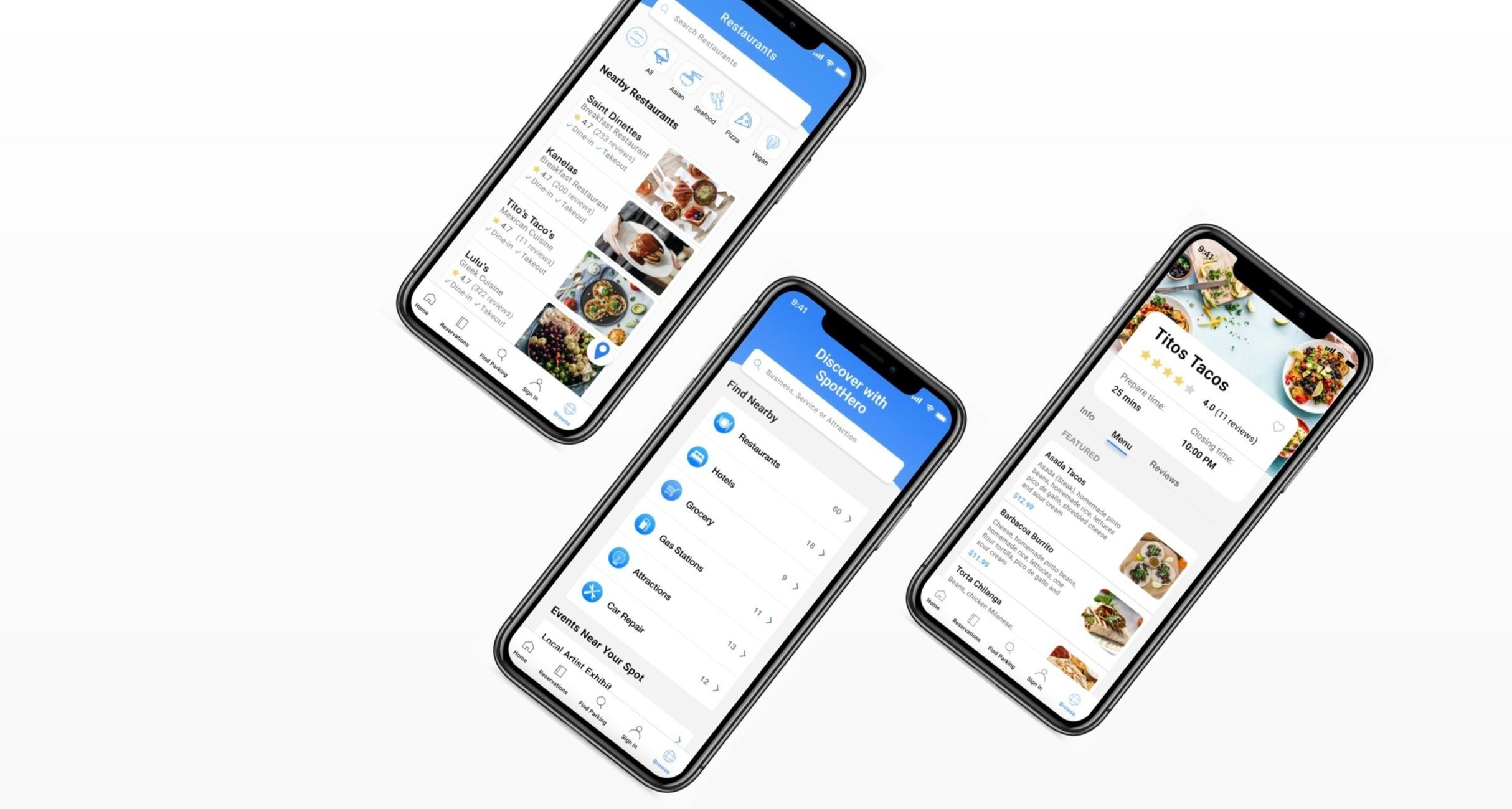
For an exploratory project to add a feature to an existing product, I designed a browsing feature solution for SpotHero to help users effectively find nearby businesses and services to optimize the overall parking experience.
My Role
UX Designer
Interaction Designer
Prototyping
Testing
Platform
iOS Mobile App
Timeline
September—October 2021
The Problem
I conducted interviews with 10 individuals who have used SpotHero previously to learn more about the application and how it could be improved.
I identified 2 user problems with the model:
1. Not knowing what is around them
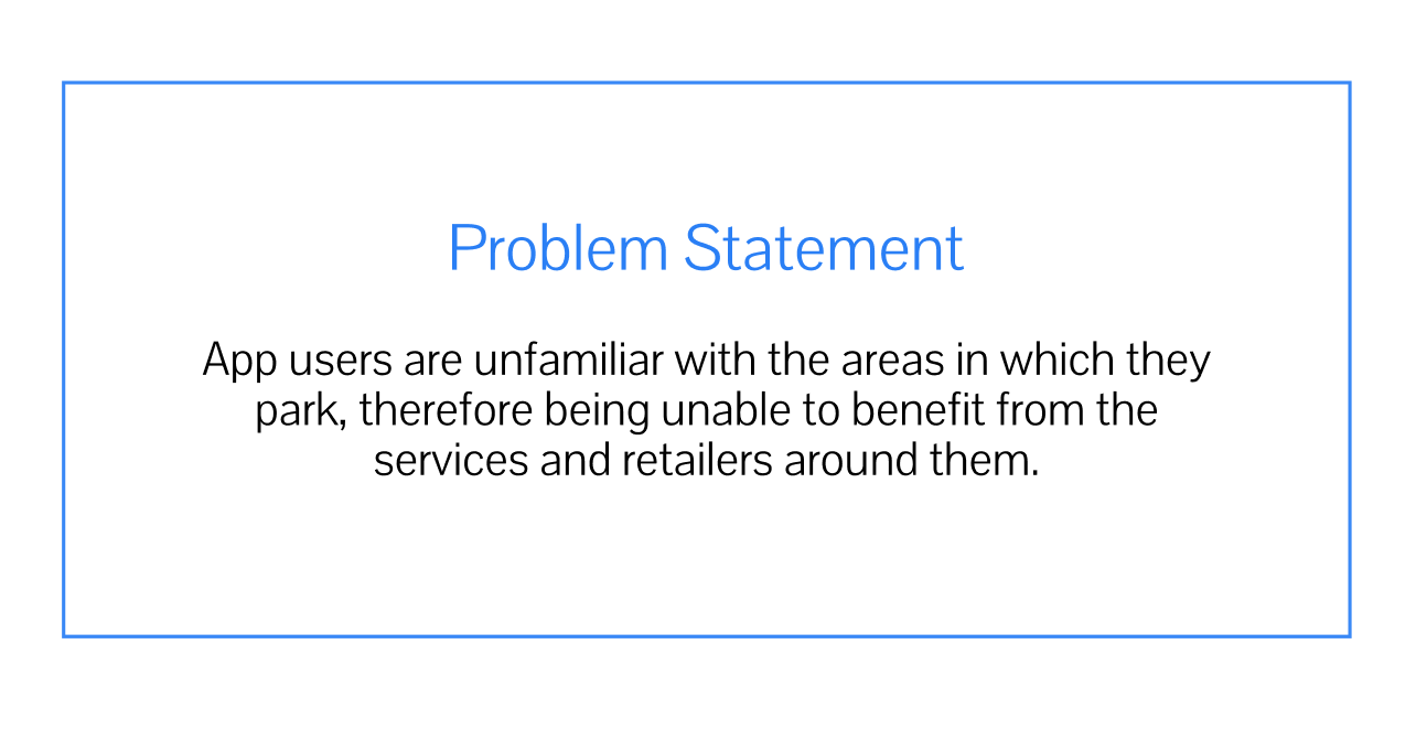
App users are unfamiliar with the areas in which they park, therefore being unable to benefit from the services and retailers around them.
2. Using multiple applications to plan commute
Users switch between browsing applications and SpotHero to find a spot near desired area.

A survey was conducted with 20 participants to get a better understanding of the problem space.
Objectives of the survey were:
Learn about participants experiences using SpotHero
Determine what businesses and services SpotHero users would benefit from
Gain insight on how participants utilized the application and where they found value
Key Findings:
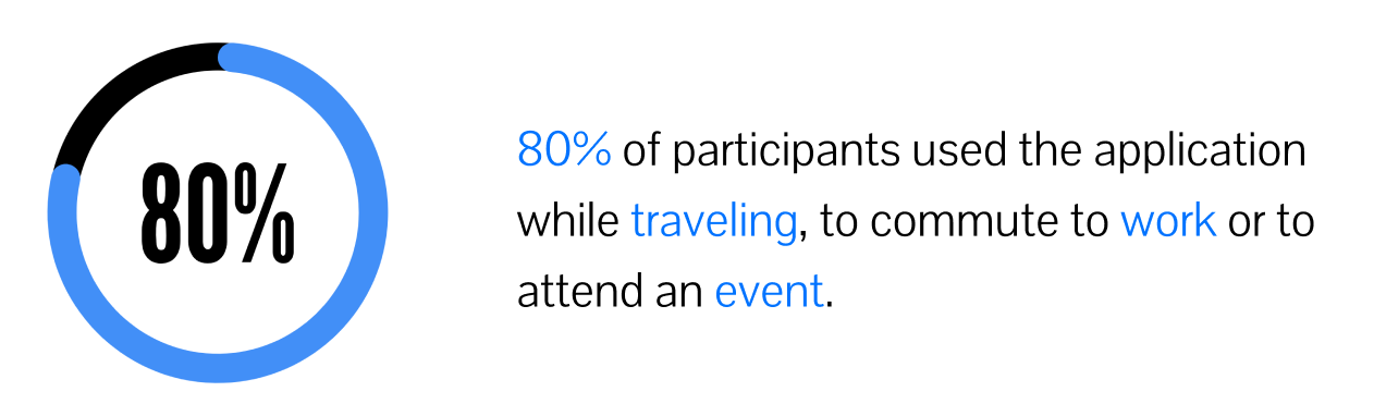
Other key insights :
Majority of participants only use the application a couple times a year
60% of participants surveyed reserved their spot for over 24 hours
Majority of participants highlighted that they would be interested to find cafes and restaurants near their parking spot while others noted hotels and gas stations.
Analyzing the problem space
After conducting the survey, I discovered the problem areas with SpotHero and I wanted to learn more about browsing and parking applications, their pros and cons, and what SpotHero can do better to potentially attract more users than these competitors.
Direct Competitors

An easy way to switch between host and driver accounts.
Built-in walking/driving directions to parking spot.
Apple Pay support (for iOS devices only).
Clean map UI with smooth performance.
Destination Support Apps

All the applications I analyzed provided customer reviews, directions and connected users directly to websites
Yelp went as far as booking reservations, ordering takeout and delivery.
Browsing by map is popular among the three applications as it provides the user a better idea of how far services and attractions are from their current position
Solution
Putting it all together
By conducting user research I was able to identify how a browsing feature will impact SpotHero and its users.



Community Connection
Integrating app users to local communities
New Business Opportunities
Expanding into retail and services and new form of monetization
Unified Application
Improving user efficiency by combining parking and retail browsing services
With this, I plan to use these three core attributes to guide my design decisions in order to best cater to my users needs
Empathizing with SpotHero Users
After getting a good understanding of the parking industry and analyzing some of the leading retail and services browsing applications it was time for me to talk to SpotHero users to get a better understanding of their experiences and pain points
Information Architecture
User Flow
Since I was adding a brand new feature I wanted to create a process that would be easy to access and execute. I knew that I wanted the feature to be accessible from the homepage and allow users to browse and filter through nearby results.
Task: Find nearby attraction
Scenario: Jane is visiting Seattle for the first time and would like to find a nearby attraction.
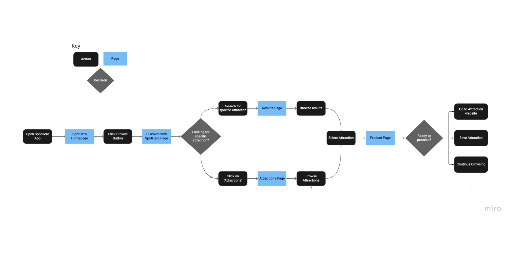
The user flow above displays a users process in a given scenario, In this case the user flow showcases the Jane’s entry point and provides a set of steps towards her final action.
View→ User Flow
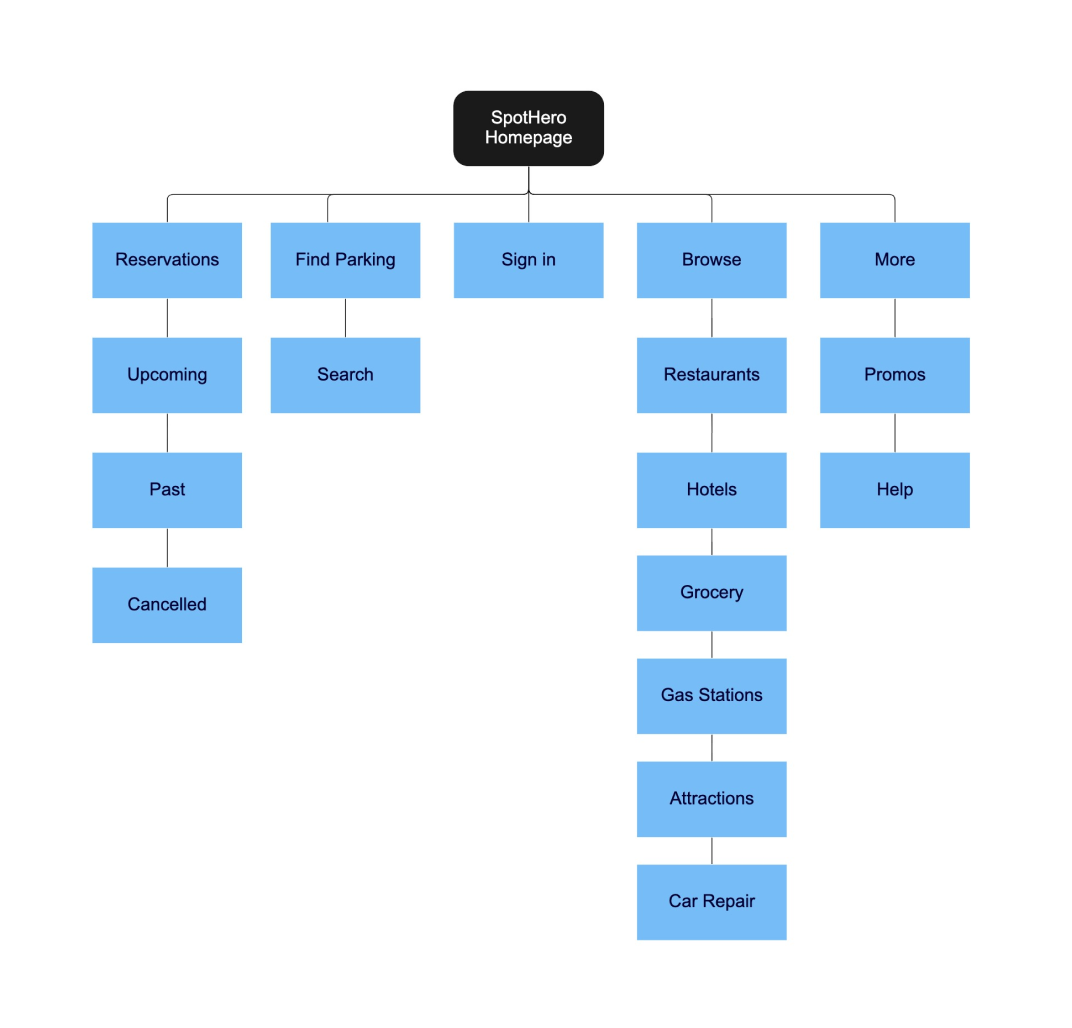
App Map
The app map above showcases the different screens in the application and the relationship between them.
Designing
Sketches
“How might we create a browsing process that aligns users needs to prevalent retailers?”
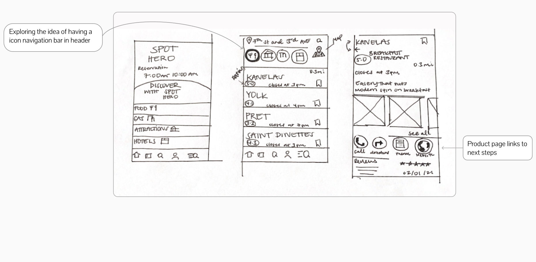
In these sketches I aimed to explore ideas of how the interface would look like when using the Discover with SpotHero feature from start to finish.
Wireframes
By creating my wireframes I was able to establish a point of entry for my feature that fit in well with Spothero UI. I decided to create a browse Icon in the main navigation that would guide users to the feature.
In my initial wireframe I focused on all of the components needed to create an effective experience.
A browse page that function as main menu for restaurants, attractions and events
A map function that provides visibility to nearby businesses
Filtering properties throughout to simplify search
A product page that guides users to next steps
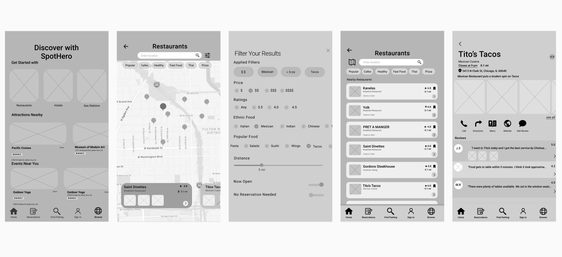
The main issues with the initial wireframe included problems with visibility in imagery, inconsistency in user interface and lack of efficiency in navigation.
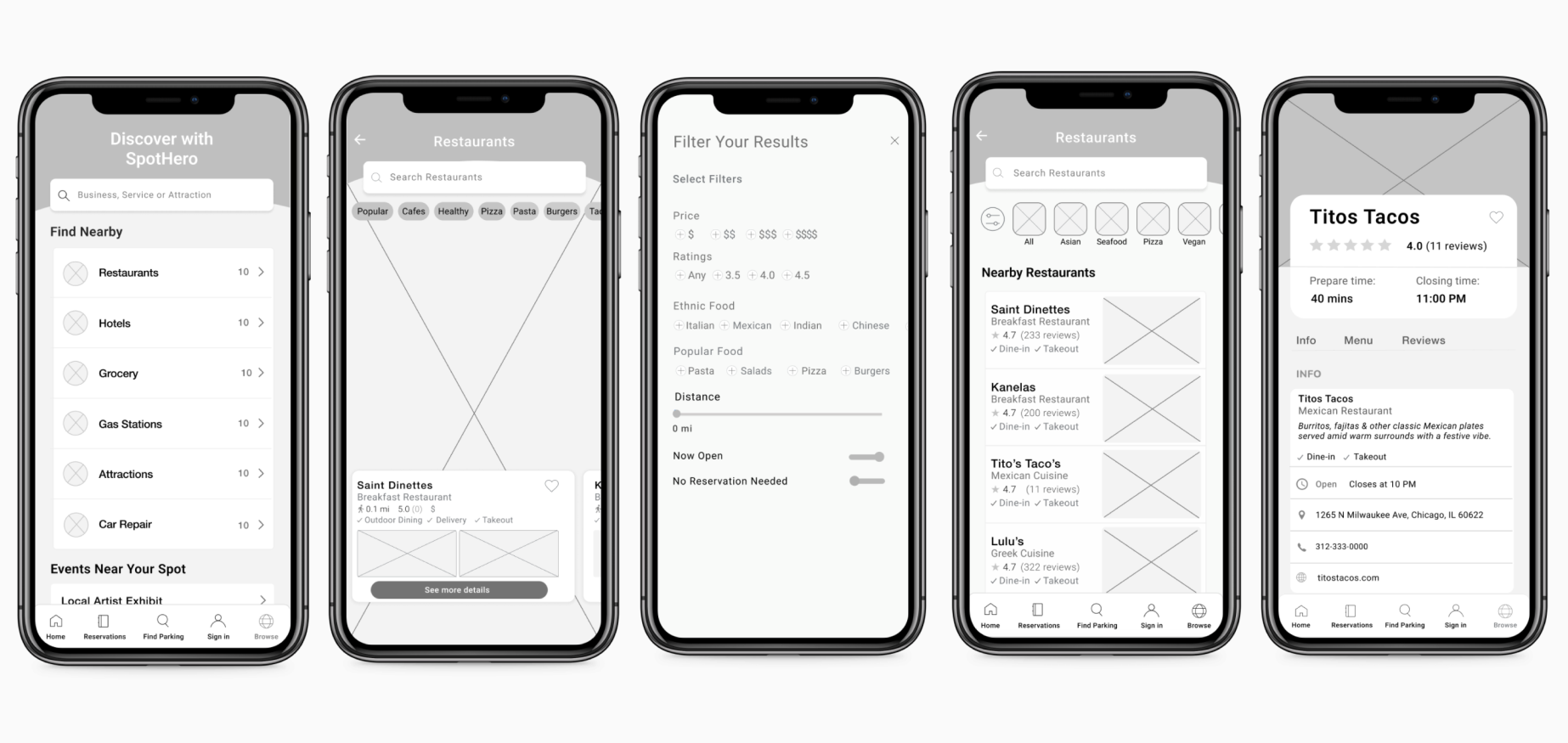
The final wireframe enhanced usability by consolidating imagery, emphasizing the call to action and creating a UI that felt native to the original branding.
Prototype
When creating the prototype my priority was to use SpotHero buttons and material design icons to give the interface a familiar feel. I was able to implement a browse button in the main navigation as an access point to the feature.
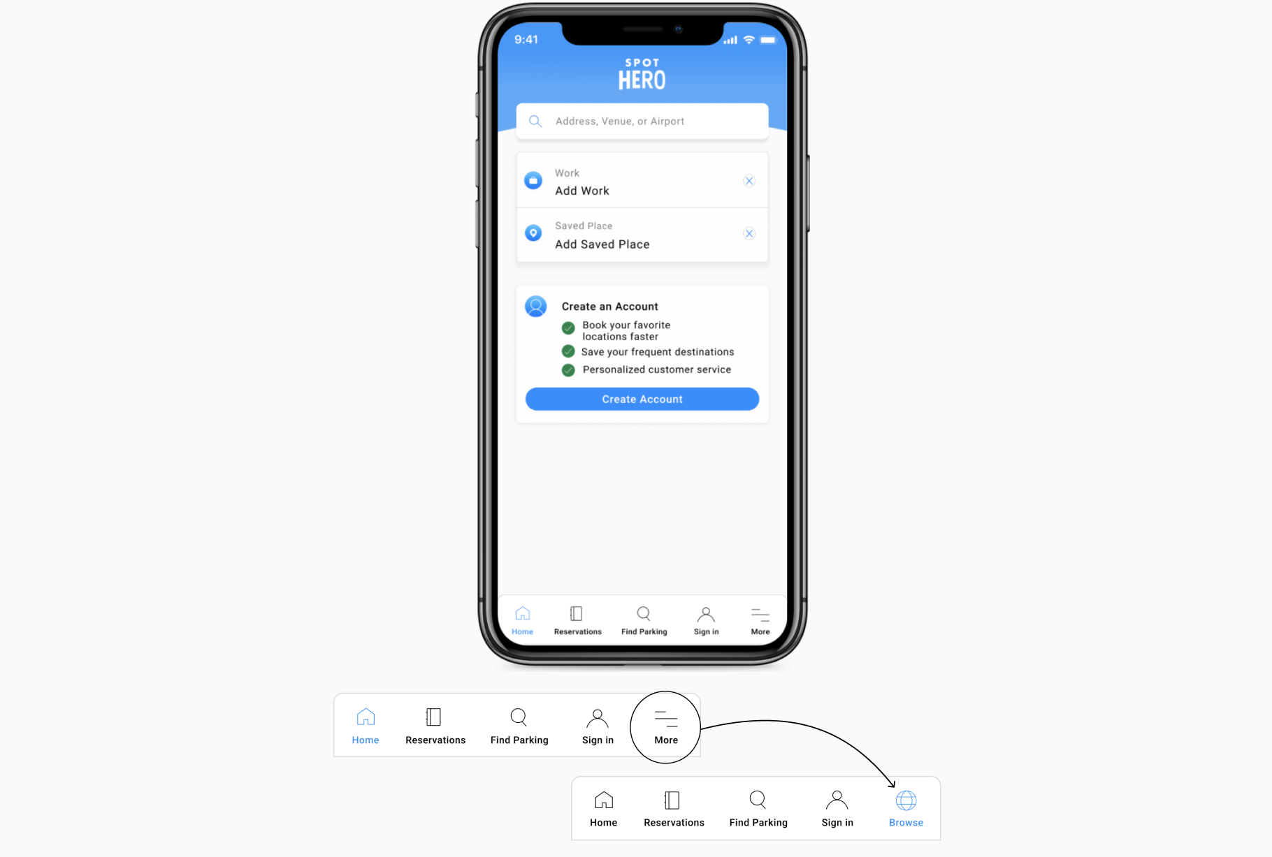
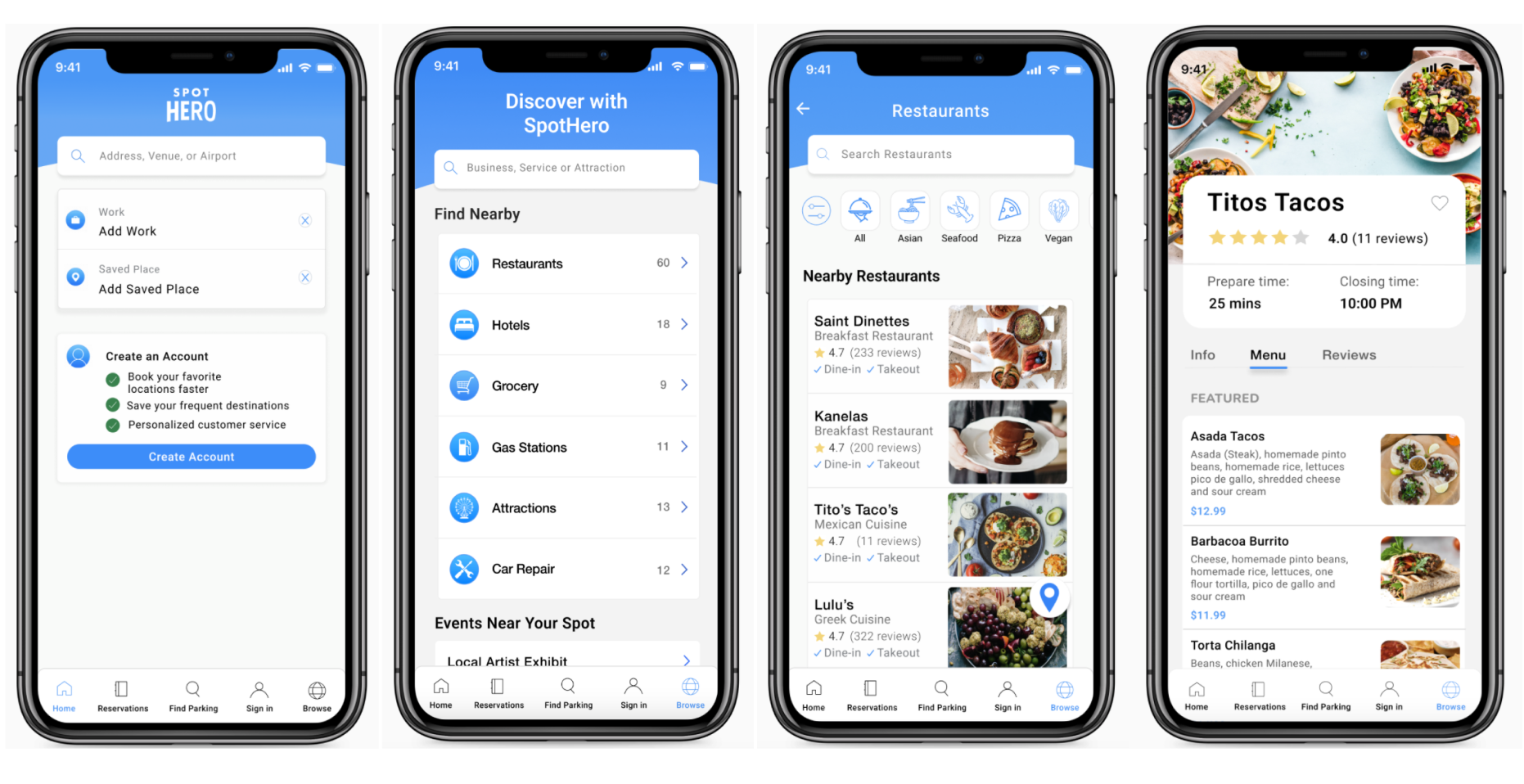
Once I was satisfied with the look, I developed a prototype for future usability testing.
Usability Test
As with every prototype, it was essential for me to complete a usability test in order to confirm that users weren't struggling with completing tasks.
Usability test objectives:
• Determine usability issues throughout the Discover with SpotHero experience.
• Pick up on any areas of frustrations participants are having throughout their tasks.
• Understand the the user feels when completing their assigned tasks.
I conducted the usability tests in-person, but also over Zoom calls using screen share feature. I had participants go through the application and guide themselves through the experience.
Main findings:
• The map icon wasn't noticeable to some participants, so increased the overall size to make it more clear.
• One participant highlighted that the font also felt a little small in some parts so I increased all the fonts on the application to 16px.
• The back button from the product page seemed to be hard to click as the arrow felt small so I increased the clickable area so it was easier to hit the button.